
BiocStyle updates for mobile screens
Until recently BiocStyle didn’t render particularly nicely on narrow screens e.g. if you’re reading a vignette on a phone screen. The left and right margins dominate and compress the main content to be almost unreadably narrow e.g.


For the next Bioconductor release @andrzejkoles and I have added some additional CSS that comes into play when the screen width is less than 768 pixels. The changes include:
- In-chapter navigation panel removed.
- Left indent for lists removed - now aligned with left margin.
- Right-hand margin removed.
- Margin notes now appear inline & are displayed/hidden by clicking on the relevant reference number in the text.
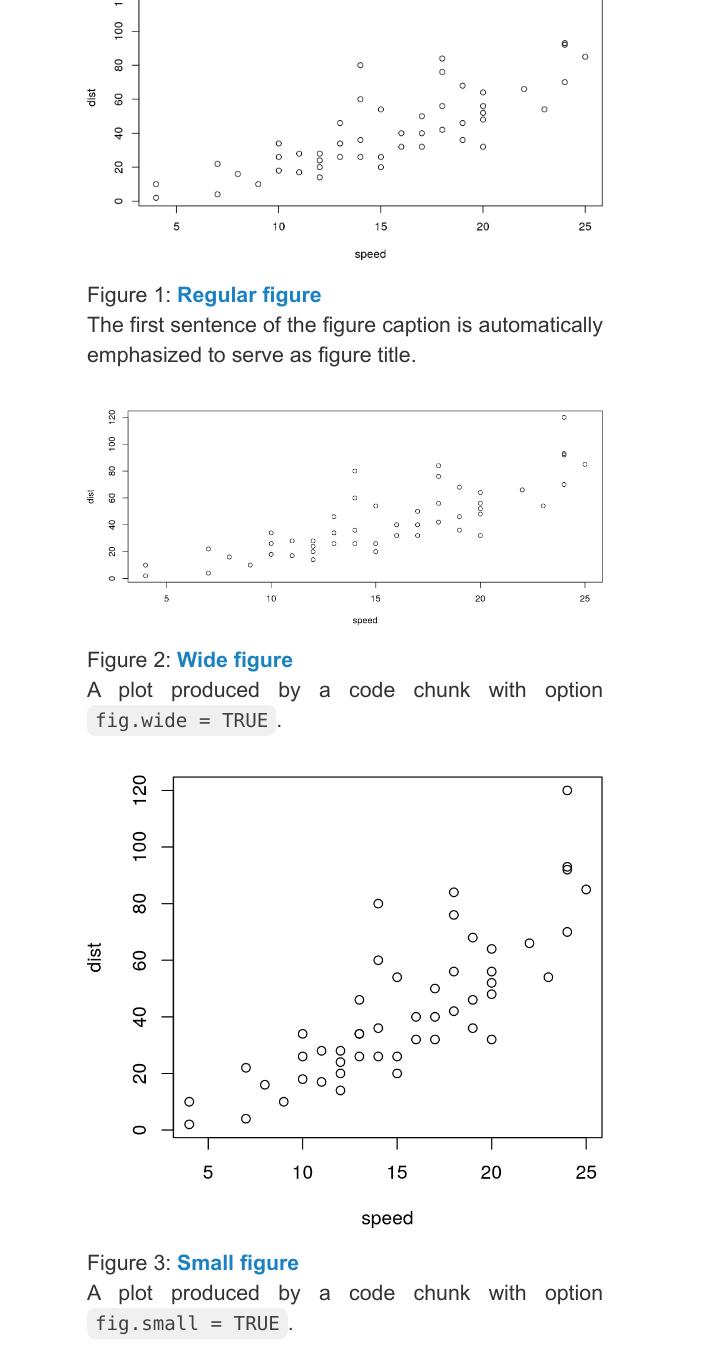
- All three figure sizes now fill the full width, but their aspect ratios are maintained.
- Tables and code blocks do not wrap, but scroll horizontally.
Examples of some of these can be seen below:

For ‘medium’ sized screen (width between 768 and 992 pixels) like a tablet, it picks a hybrid of the existing and narrow styles, with the left-hand floating navigation retained, but most of the other changes still implemented e.g.

We’ve tested this on a few different vignettes and browsers, but would welcome any feedback by opening an issue on Github
